Financial platform
TopUp –
Mein Studium. Mein Plan.
The Mission
„top up“ is a financial management platform, that wants to support and educate young prospective students and students with financial questions during their studies. Students can obtain comprehensive information on all aspects of life. They also can contribute their own questions, share financial tips and can also get in touch with each other.
Discover
Research
Online survey
Target group analysis
Competitive analysis
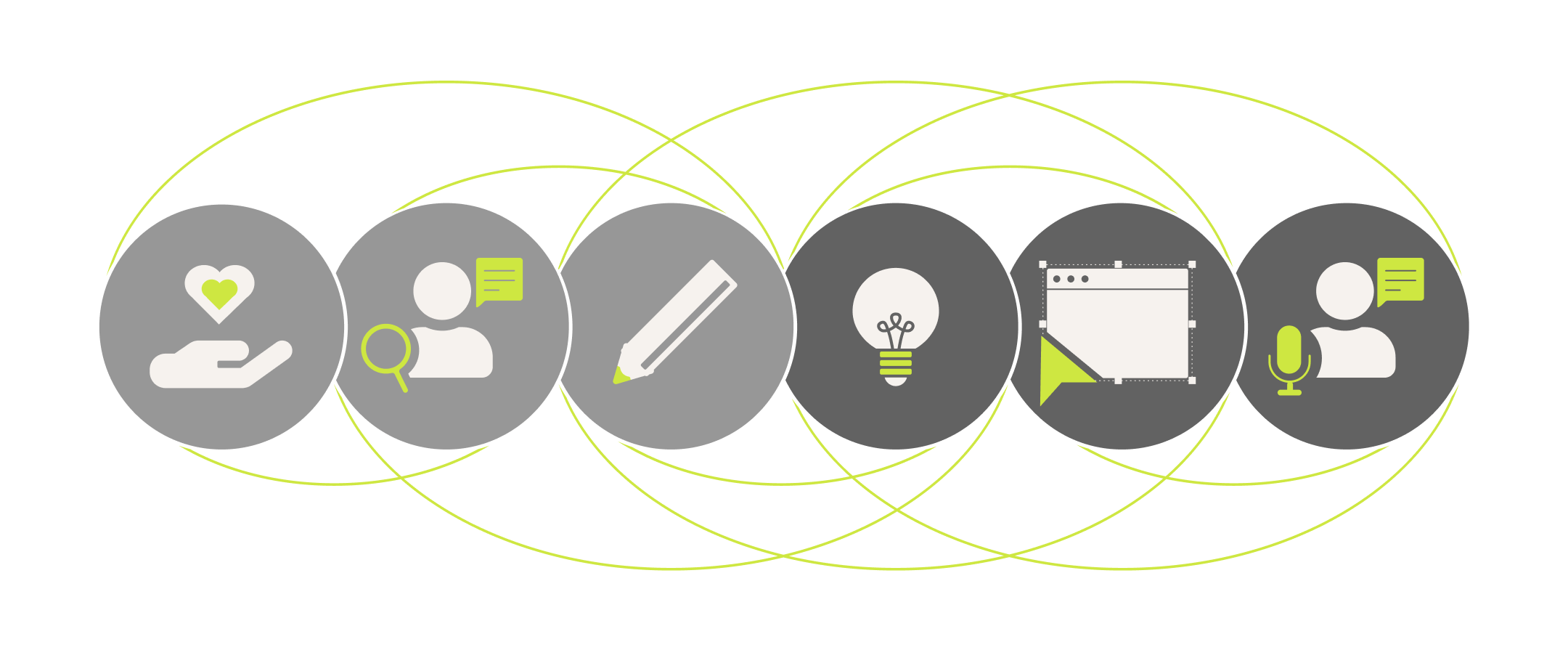
Ideate
Brainstorming
Ideation
Sketch
Wireframe
Sitemap
Usability Tests
Realize
Screen Design
Prototyping
Printdesign
Our goal is to make the topic of finance accessible to every student. No matter, what your background is, how deep your knowledge or where you come from. Everybody has the right to get education and everyone should have the ability to finance it.

Challenge
It is statistically proven that in recent years the indebtedness of young people has increased enormously. The greatest increase in over-indebtedness can be seen in the age groups under 25. Many young people do not know how to get their finances under control. Students in particular have to manage their money carefully. The subject of money raises many unanswered questions. Savings potential? The cheapest electricity, mobile phone or Internet provider? Financial aid from the state? A possible scholarship?
Motivation
Our motivation was, to make the conscious handling of money a matter of course and, above all, make knowledge easily accessible for everyone. It is called „education for all – also without starting capital“. No one should be excluded. This is our principle to be conveyed.
Discovery
In order to better address these individual needs of the target group, a quantitative study of 100 students were surveyed online. The survey was divided into different areas. In addition to personal information, the survey asked about previous knowledge as well as the current situation and general knowledge about current offers for students. The evaluation showed that first-year students were often wrong in their assessment of financial expenditure.
The first phase also included reserach of a wide range of different information materials. These included specialist literature, websites, brochures, mostly product/company-related, and guides. We found many painpoints this way.

Understanding and Insights
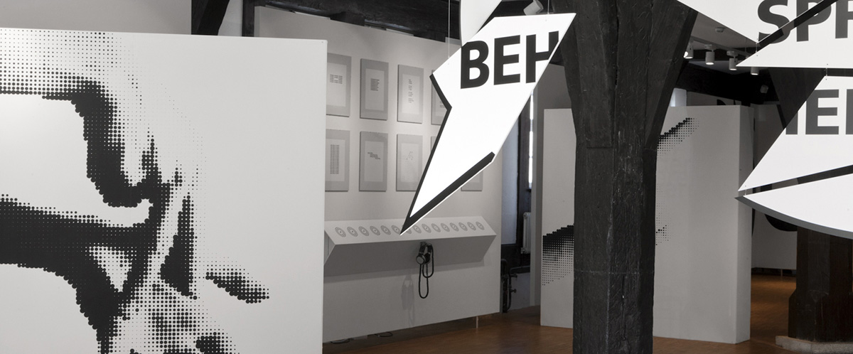
In order to provide young people with better access to the topic of finance, the information must be more easily accessible and, above all, more logically structured and designed. This had to be achieved through a simply structured layout. Catchy headings should make it possible to grasp the content quickly. An online platform should make access easier. An even more active approach to the target group was to be achieved through a scattering medium.
- Texts must be short and written in language appropriate to the target group
- Information must come from a neutral medium with little or no self-interest
- Topic should be presented comprehensively in one medium
- Structured and easy to read, the young interested person should be able to read up on the topic.
- Current events should be taken into account.
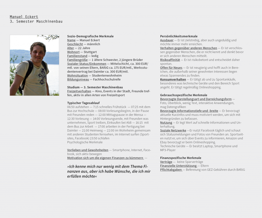
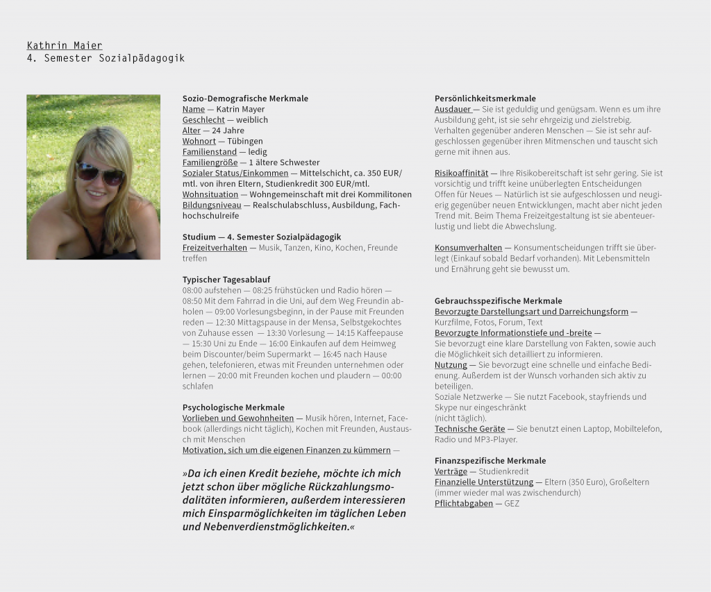
Personas
Based on the survey and interviews, different personas were created to better address the different needs of the users and to use them to run through and analyze different scenarios of the individual applications. Three personas were created for the different interest groups, each with different needs and character traits. All personas are freely invented and serve the pure research and development purpose.
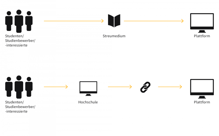
Communication Concept
Students/study applicants/interested parties are made aware of the platform through a scattering medium. Subject to reservation, these are postcards, posters or brochures. Likewise, a reference to the platform is given to the student applicant during the registration of the online application, since the student unions cooperate with the universities.
System architecture and site map
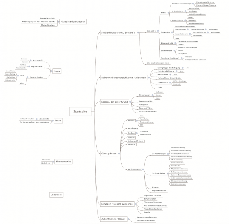
One of the challenges we faced was to structure all topics in a simple and coherent way. At the beginning, we brainstormed many different topics. The collection included all student interest areas, from scholarships and insurances to GEZ and cultural offers. These were reviewed for importance, sorted and then rated, clustered and prioritized. In order for the student to easily and quickly access the individual topics and areas of interest, we searched for comprehensible and concise top-level topics. After determining the most essential topics, we examined the platform’s process and created a system architecture. Potential new topics were also considered in the structure.
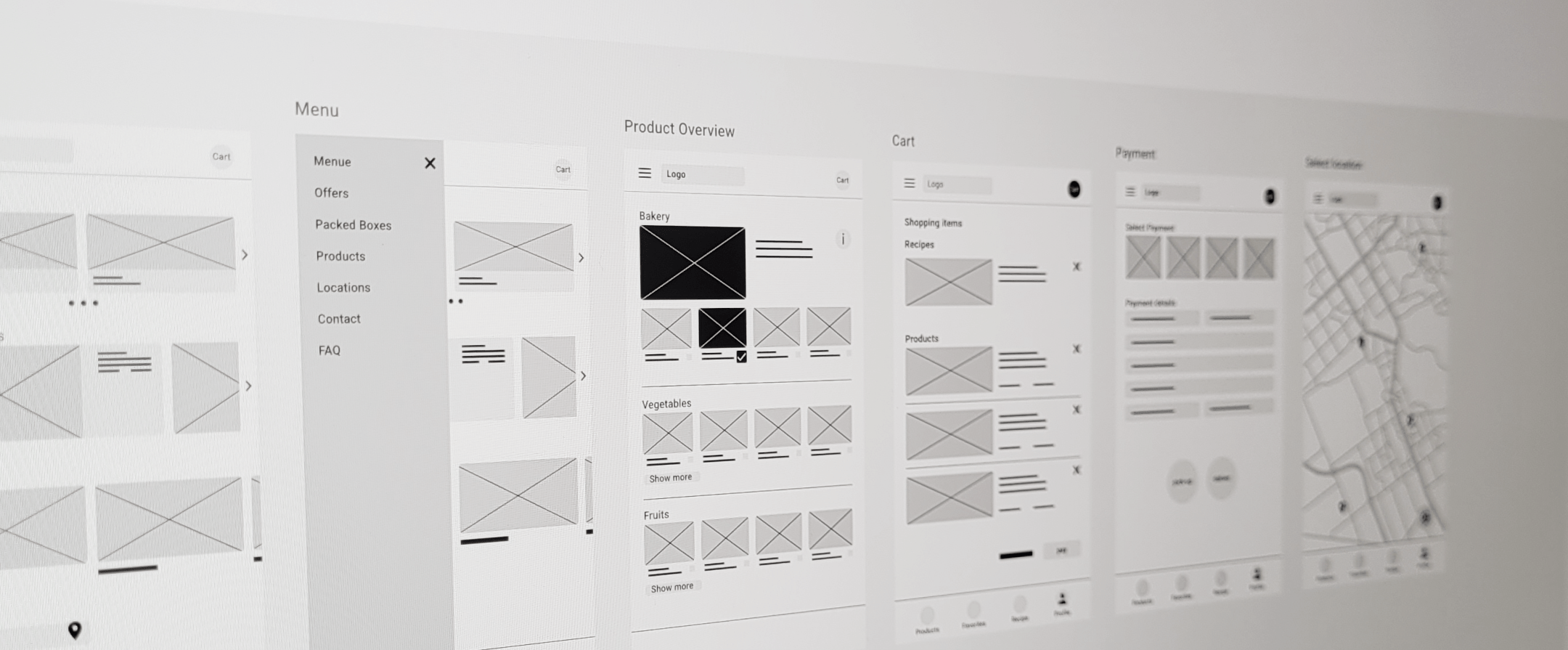
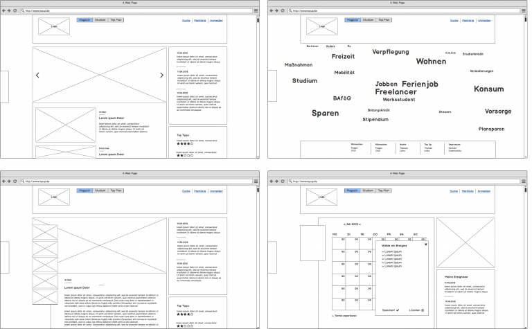
Conception & Wireframes
Before the first wireframes were created, scribbles were made to test the structure and design individuality in advance for their feasibility. Furthermore, various navigation elements were examined for their handling.


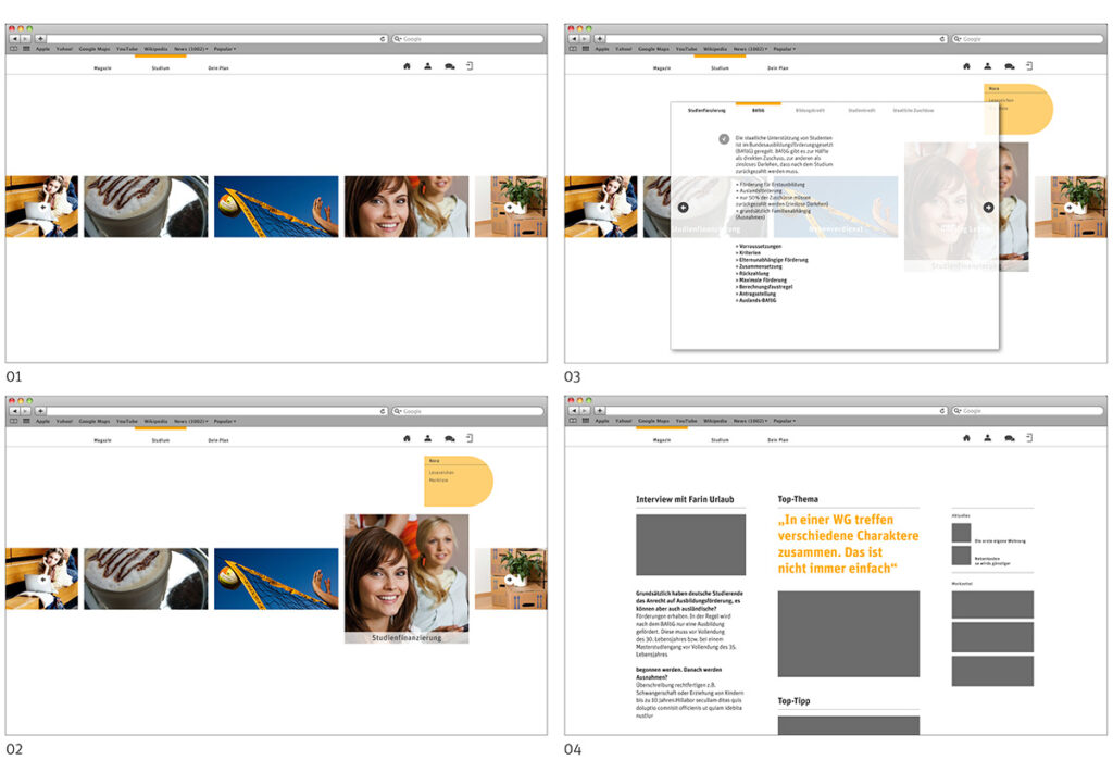
Design Process and Iteration
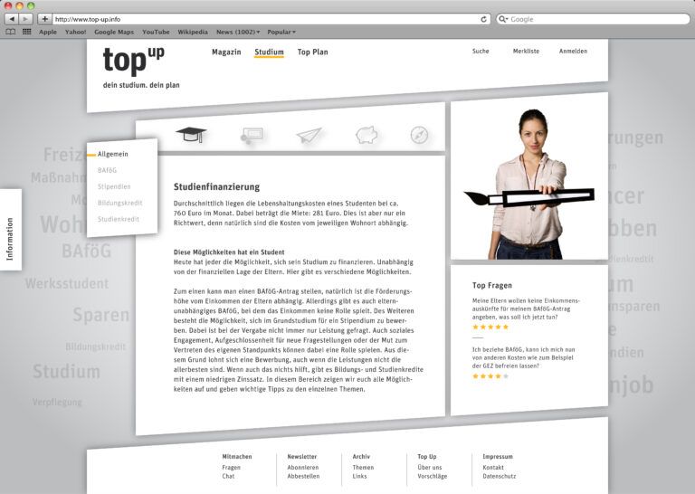
During the design process, various design variants were ran through. Several parameters were changed during the approach. An icon and image language suitable for the target group was designed with a simple recognition value. The icons are quickly recognizable and categorize the respective areas.

Solution
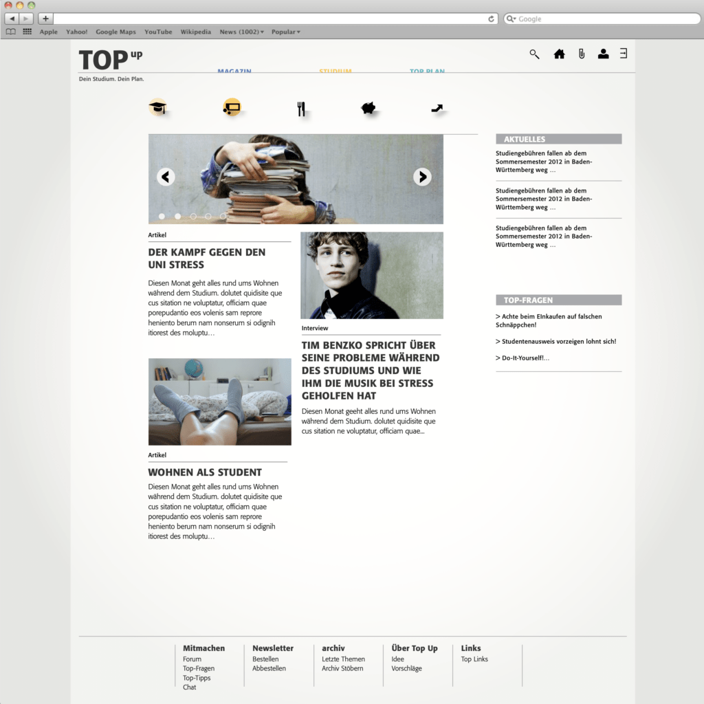
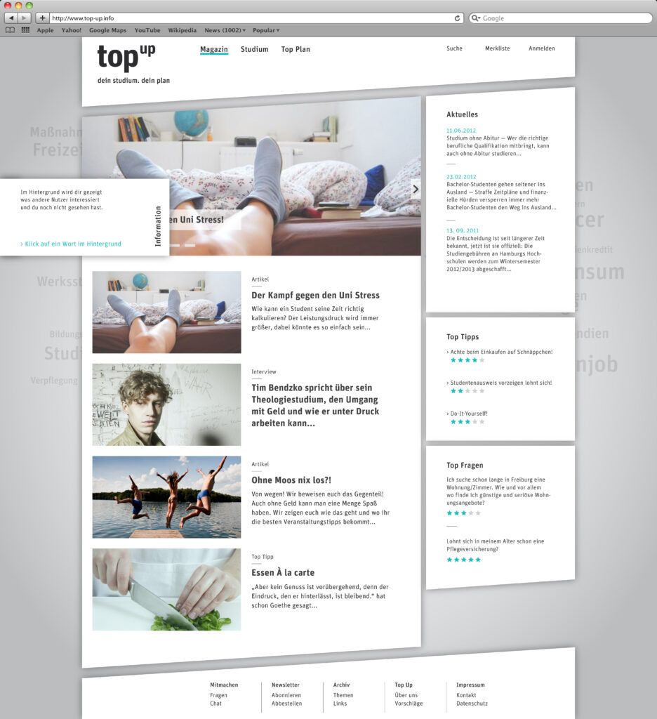
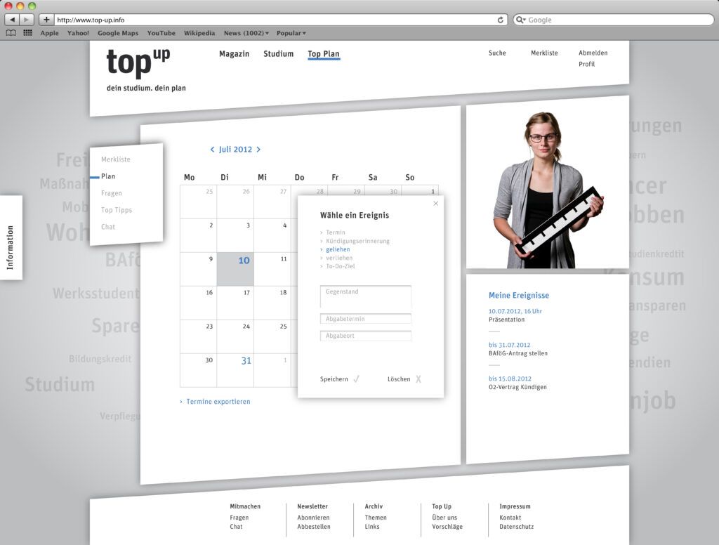
The user is welcomed on the landing page. He gets an overview of the content of the monthly changing magazine, the latest news, tips and questions. The upper area, which receives the most attention, shows the slideshow. In it, the changing monthly topics and top tips are shown. The user can operate the menu manually and also enter a topic directly from there. The cloud, a key feature is an alternative access to the study area and is located behind the main content. By clicking on a keyword positioned at the edge, the keyword cloud becomes active. This activates the second menu level. In the cloud you can choose between several views. Clicking on a keyword opens the desired topic area. The information is divided into five main topics and respective subtopics. The subtopics offer different depths of information. Depending on the area of interest, the items can be viewed individually. This allows the user to quickly find the information he or she is looking for. All topics can also be added to a watch list. To do this, the visitor must log in. The login area opens automatically when the user clicks.

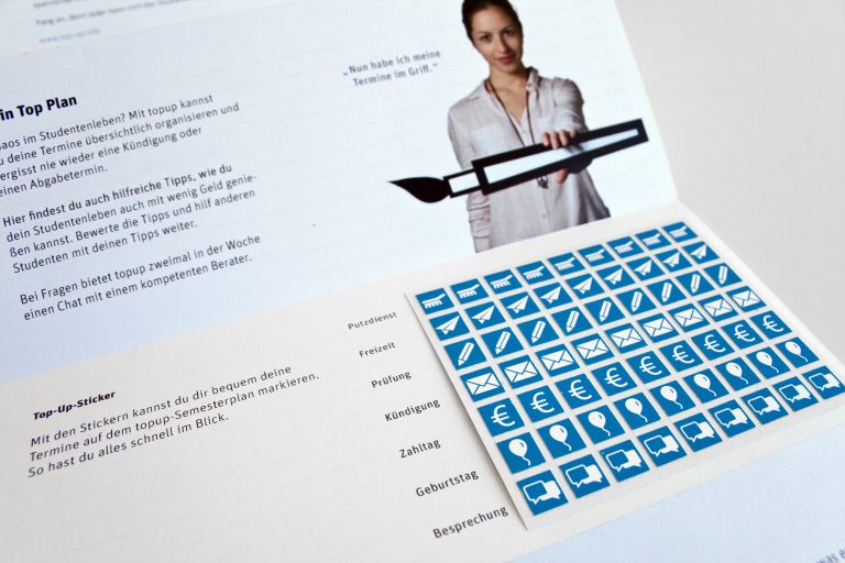
Additional Printmedia
Based on the interviews and survey results, a simple semester wall calendar was designed at the request of the participants to be attached to a bulletin board or refrigerator. The flyer introduces the platform on the front. On the back is the calendar. Dates can be marked with the help of the inserted stickers.


Impact
We have received a lot of positive encouragement for this project. Many felt that we should make this project happen. Unfortunately we did not dare to implement this topic at that time. Few years later now, there are several platforms to adress these problems.
Team
Anika Quitsch
Stefanie Nagel
Supervision
Prof. Hoffmann
Prof. Michael Götte
Tools
Photoshop
Illustrator
InDesign
After Effects
Mindmap