The (Family) Food Organizer — Greenies the Foodstore APP
The Mission
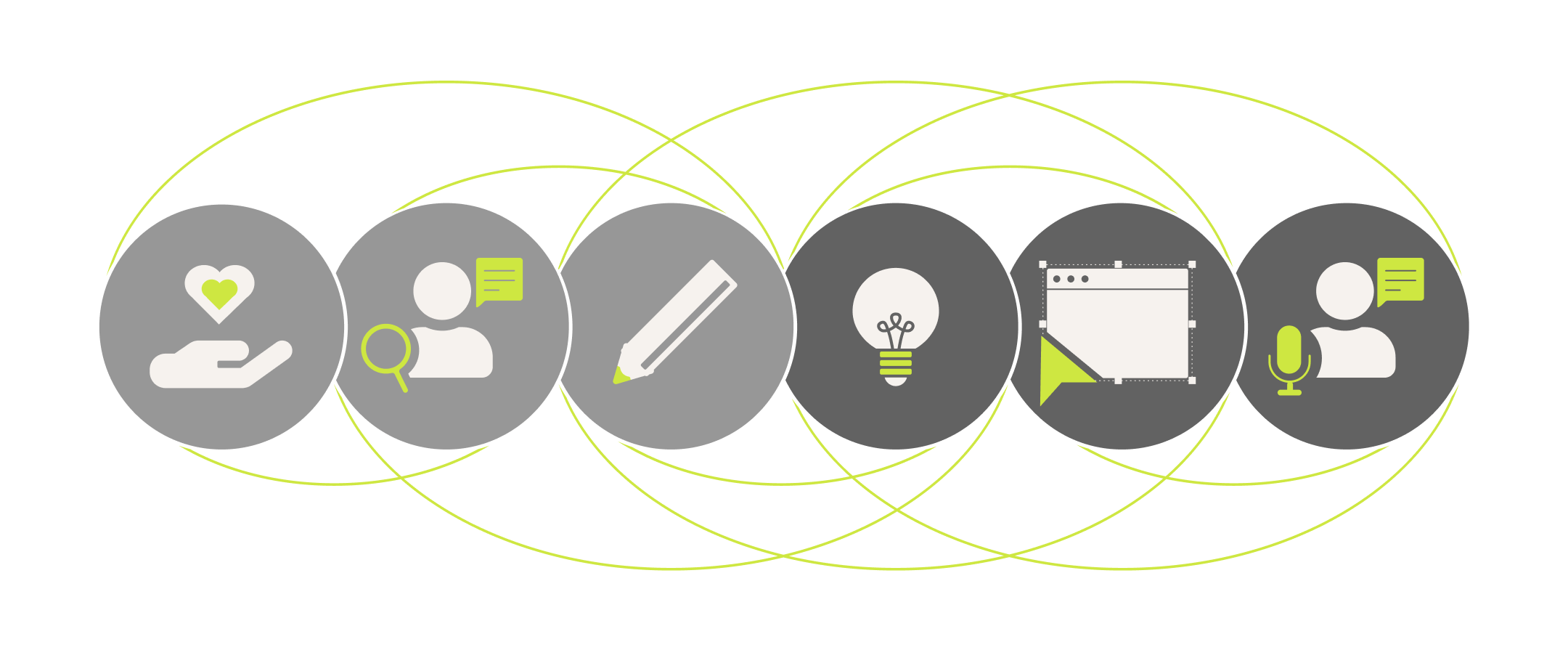
Based on the Google Design Thinking Process, the challenge was to „design a mobile ordering app for a shop in your hometown“. After interviews with several people, I developed personas and a user journey map. In order to do that, I needed to find a problem statement and formulate a goal statement. Multiple steps were taken to create a lo-fi prototype. The project is currently on hold and not fully completed yet.
Duration
free project
2 months (partly)
currently paused
User Experience
User Research
Wireframes
Lo-fi Prototyping
Tools
Figma
Miro
Project summary
In this case study the different steps of the design process were especially focused on the best user experience possible.
In order to achieve this, I had to empathize with users and conduct interviews, so I got user insights and built empathy-maps to identify user pain points and develop personas. Based on the personas I crafted user stories to better capture the user needs. As a next step, user journey maps were created, where I wrote a problem statement and hypothesis statement to understand the user needs and to completely empathize with them.
In the ideation process I used the „how might we“ and „crazy eights“ methods. Then goal statements were formed and user flows developed to create a big picture and close-up storyboards. After these steps I was able to create initial paper wireframes. In addition to that, I made a small information architecture and transferred that to digital wireframes in figma to finally develop a lo-fi prototype.
Goal
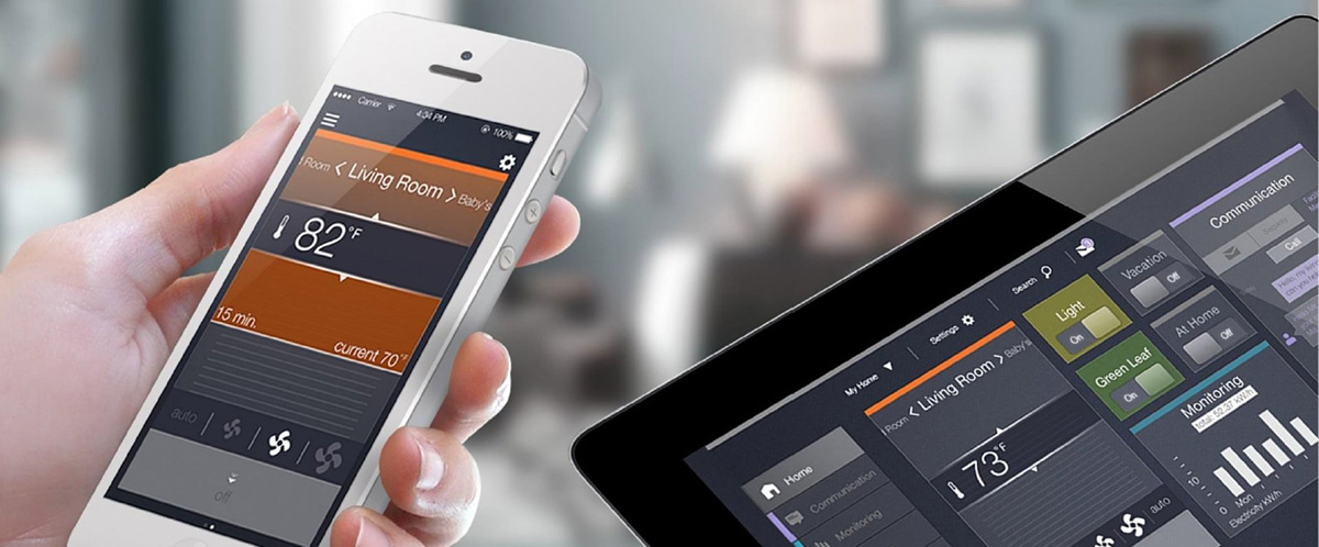
Greenies helps families organize their meals in a healthy, local and seasonal way. It contains food without hassle. Reliable delivery adapted to parents‘ needs.
Basically the goal of this project was to „design a mobile ordering app for a shop in your hometown“. As a UX designer, I followed the design thinking framework and went into the process of empathizing to understand and feel the users needs.

User research — summary
I conducted interviews and created empathy maps to understand the design and user needs. A key user group identified through the research process were working parents who are stressed by daily work overload and therefore less likely to purchase healthy foods.
This user group confirmed initial assumptions about ordering food from the local organic market. The research shows that time and distance were a major factor that discouraged users from shopping at the local organic market. In addition, users felt that the price differences at the organic market were too high compared to the supermarket.
Empathy Map based on Interviews
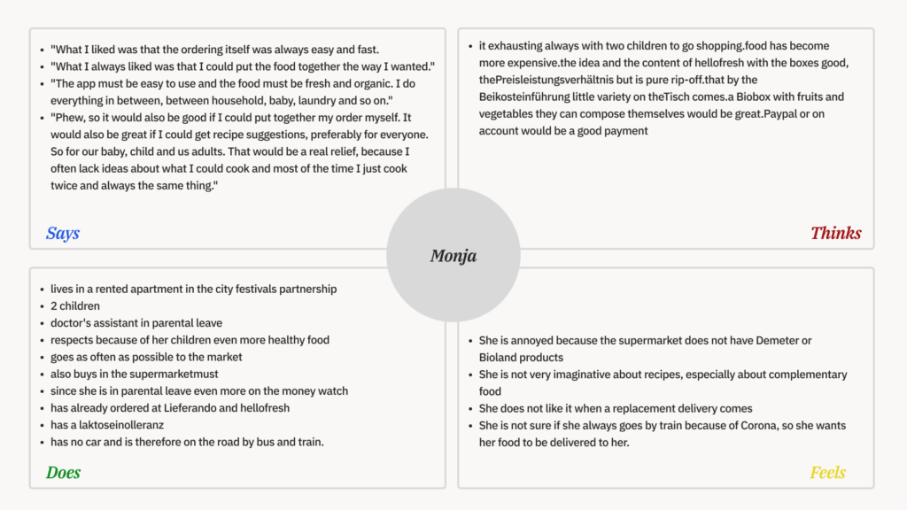
Pain Points
- Time
Parents are too busy to make long trips to the grocery store with their children. Preparation, execution, follow-up and shopping simply take up a lot of time. Money
Food shopping is becoming more and more expensive, especially if focused on healthy and high quality products. Users exprerienced these products to be even more expensive at local organic markets than in conventional supermarkets.Accessibility
Small local businesses are more likely not to be barrier-free compared to large supermarkets. This can be quite annoying, when children still need transport such as strollers and baby carriers.Inspiration
Often the user lacks ideas for recipes for cooking with healthy foods.
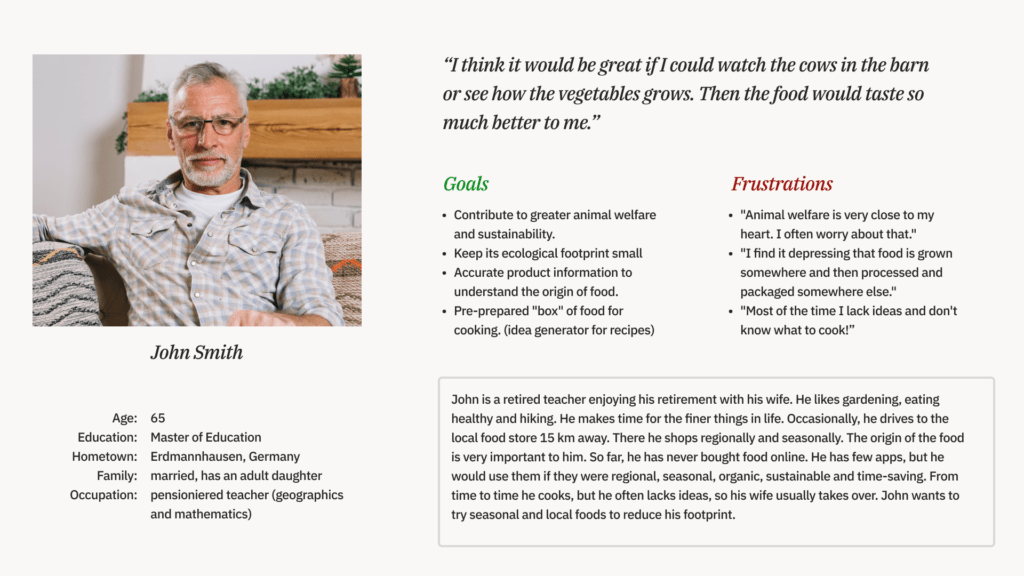
Personas
Based on the experience interviews and the contextual inquiries, two personas were created. Each persona represented one user group and thus covers different types of customers.
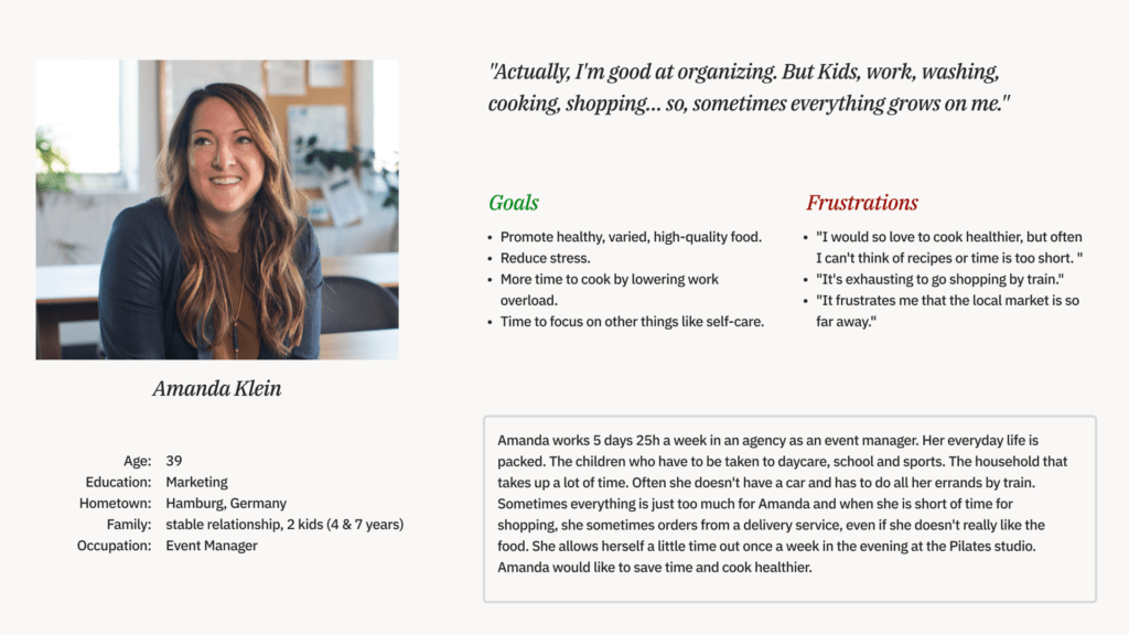
Problem Statement of Amanda (Mother and Eventmanger)
<span data-metadata="">Amanda is a mother of two young kids who needs support to create a lunch plan and to do the weekly shopping because she has to travel a long way by train with the children to the nearest organic food store to buy fresh produce.
Competitive audit — What are the others doing?
There are many competitors in the world of grocery delivery. There are also some stores, especially large supermarkets, where you can shop online and via an app.

User Journey Map
User journey map was created based on the primary persona (Amanda). The user journey revealed how helpful it would be for users to have access to a dedicated shopping app of their local organic food store.

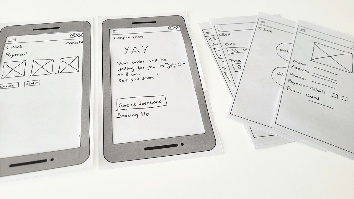
Prototype and Test
Paper wireframes were used to decide on the layout of key screens. These paper wireframes show different kind of home screens. Taking the time to draft iterations of each screen of the app on paper ensured, that the elements that made it to digital wireframes would be well-suited to address user pain points. For the home screen, I prioritized a quick and easy ordering process to help users save time.
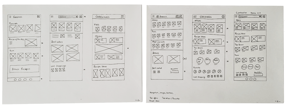
Digital wireframes
Then they were digitized and a low-fiedelity prototypewas made. The low-fidelity prototype connected the primary user flow of buying healthy food for pick up or deliver from a local food store. So the prototypes were used in a usability study to check with users.


Next Steps
Currently the project is on hold.
The next steps will include usability testing, the definition of visual design and the realization of an hi-fi prototype which will also enter the test cue.